|
A scatter plot is used to determine whether a relationship exists between two sets of data.
|
|
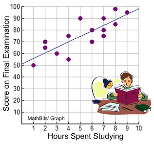
We saw in the last lesson, that the scatter plot at the left displays the relationship between the number of hours spent studying and the scores on the Final Examination.
It appears that the dots are clustering around a straight line moving upward across the graph.
A linear regression equation was found to predict the pattern seen in this graph.
Notice that the slope of the line is positive. As the number of hours spent studying increases, the score on the Final Examination increases.
There appears to be a "correlation" between the hours spent studying and the Final Examination score.
|
|
Correlation measures the strength of the linear association between two quantitative (number) variables. |
|
When attempting to find a correlation, remember that:
1) "correlation" applies only to quantitative (number) variables.
2) while a correlation can be calculated for any pair of variables, it only measures the strength of the linear association, and will be misleading if the relationship is not linear.
3) outliers can distort a correlation (if an outlier is present, report the correlation with, and without, the outlier).
Tidbit of Info:
 |
People may say there is "a strong correlation between hair color and IQ scores." What they mean to say is "a strong association between hair color and IQ scores", which , BTW, is a ridiculous statement. "Association" is a vague term describing a relationship, while "correlation" is a very precise term describing a linear relationship between quantitative (number) variables.
(Hair color is not a quantitative (number) variable, it's qualitative, "Correlation" does not apply.)
|
|

There are different types of linear correlations and different strengths to these correlations.
 Positive Linear Correlation: Positive Linear Correlation: |
A positive correlation indicates the extent to which data values increase at the same time. The y values will increase as the x values increase. The graph of such data will resemble a line rising from left to right. The slope of the line will be a positive number.
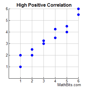 These data points can be described as clustering about a rising straight line with a positive slope. The extent of the positive relationship will be strong.
 |
|
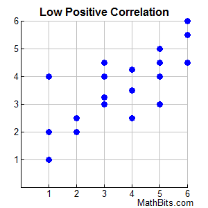
These data points are not clustered to clearly show a straight line. They "tend" to be rising, but the extent of the positive relationship will be less strong (weaker). |
| Negative Linear Correlation: |
A negative correlation indicates the extent to which one data value increases as the other decreases. The y values will decrease as the x values increase. The graph of such data will resemble a line falling from left to right. The slope of the line will be a negative number.
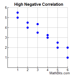 These data points can be described as clustering about a falling straight line with a negative slope. The extent of the negative relationship will be strong.
 |
|
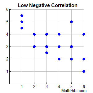
These data points are not clustered to clearly show a straight line. They "tend" to be falling, but the extent of the negative relationship will be less strong (weaker). |
| No Linear Correlation: |
If there is no apparent relationship between x and y, the data are said to have no correlation.
The x and y values are referred to as being independent.
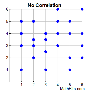 There is no way of knowing from these data points if the pattern is rising or falling. A straight line cannot be found. There is no implication of a relationship.
 |
|
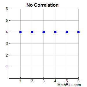
Be careful here! While a straight line passes through these points, the line is horizontal with a slope of zero (no change). This indicates that the value of x has no influence in changing the value of y. |
Consider this situation:
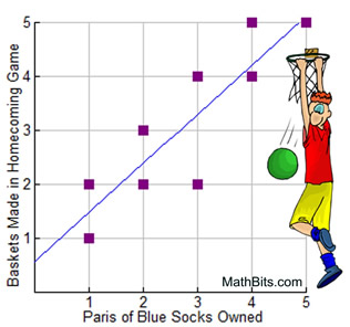 |
The scatter plot at the left displays the relationship between the number of baskets scored at the big homecoming game and the number of pairs of blue socks owned by the players. It appears that the dots are clustering around a straight line moving upward across the graph. (Yes, this is a ridiculous comparison, but please read on!)
A linear regression equation showing a strong correlation was found to predict the pattern seen in this graph.
Notice that the slope of the line is positive. As the number of pairs of blue socks increases, the number of baskets made in the big game increases.
|

It is fairly easy to find a situation where a change in one variable appears to "predict" a similar change in the other variable. When such situations are found, be careful not to assume that the change in one variable causes the change in the other variable. In this example, it is highly unlikely that owning blue socks is influencing how many baskets are made in a basketball game. Yet, the graph indicates a statistical connection (correlation) between the data sets.
Correlation does not imply "causation".
Keep in mind that there may be other factors influencing both variables in a similar manner,
or it might simply be a coincidence.
Read more about Correlation and Causation |
|
NOTE: The re-posting of materials (in part or whole) from this site to the Internet
is copyright violation
and is not considered "fair use" for educators. Please read the "Terms of Use". |
|